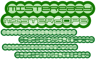
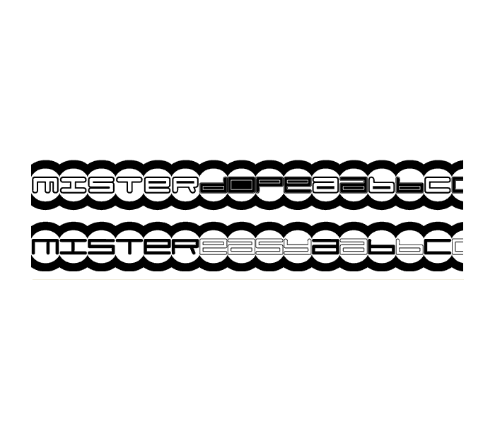
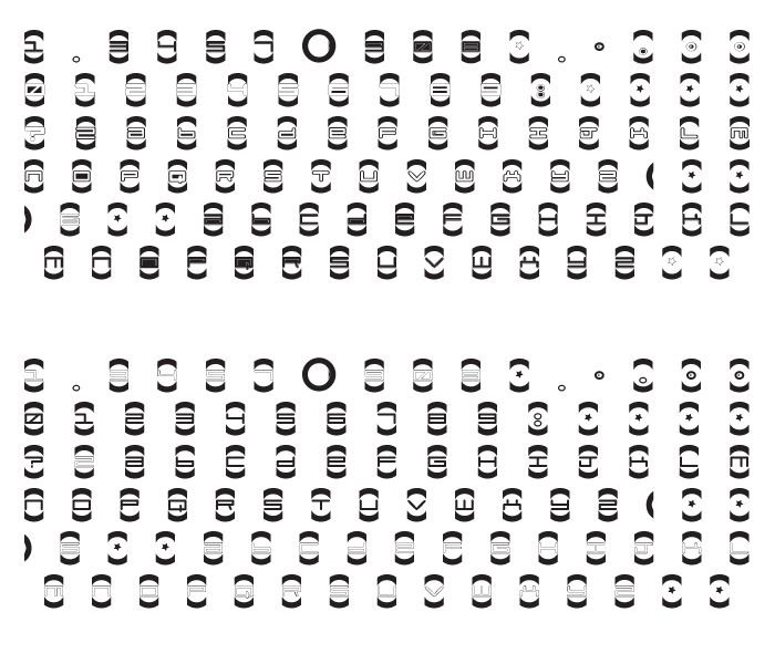
Once again, I have made a futuristic font. As you can see, I made four of them. Some of them are capital letters, some are lowercase. You can mix and match ’em while you’re typing. To make the circles close, simply use the open and close brackets. This is a font that looks decent at headliner sizes, so if you’re planning on using it for sizes under 75 points, don’t come back to me with some jibber-jabber when it looks crappy. Its a crappy font. Who gives a crap?
c. 11-02-1998
Mister Easy & Mister Dope
Copyright 2012


