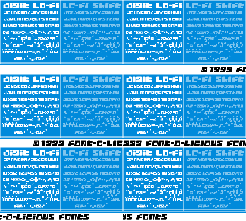
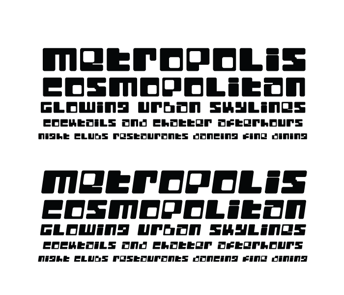
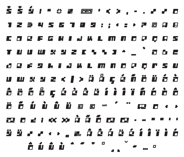
You might not notice this, but if you look close enough, you will see that this font is nothing less than a tricked out version of Metroplex. However, this font is not Metroplex, nor is it my newest electronic font, Digit. This little guy has smooth round edges and extremely generous holes in some of the letters. It is a nice font. In this piece you will also get Digit Lo-Fi Shift, which is the essential counterpart to the aforementioned. Digit Lo-Fi Shift is an extremely long name for a font, especially in this day and age, but seriously, it still sounds kind of cool.
c. 12-14-1999
Digit Lo-Fi
Copyright 2012


