He may have not been able to “Get Her Back”, but I don’t think we can blame the use of the font Alba on all of the promotional materials and album cover of Robin Thicke’s new album, Paula.
Tag : in use
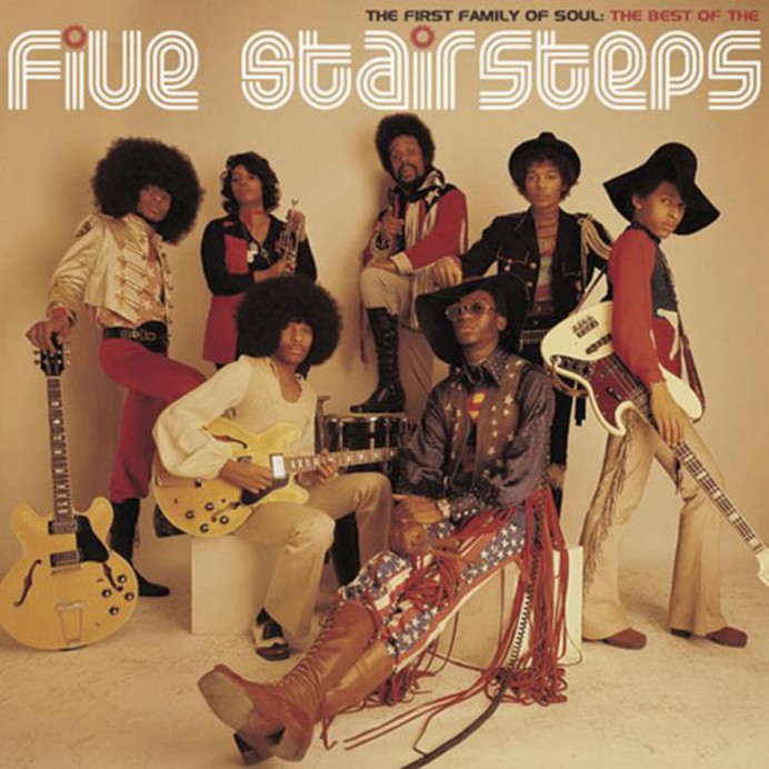
Listening to Spotify this morning and this popped up: “O o h Child” by Five Stairsteps, with Rolloglide used as the font for their Best of album. Most recently, this song was featured in the movie Guardians of the Galaxy.
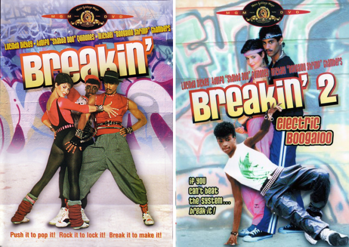
When MGM decided to repackage the 80’s breakdancing movies, Breakin’ and the notorious sequel, Breakin’ 2: Electric Boogaloo, they decided to do it in style, using the font Pussycat for the design. Push it to pop it! Rock it to lock it! Break it to make it!
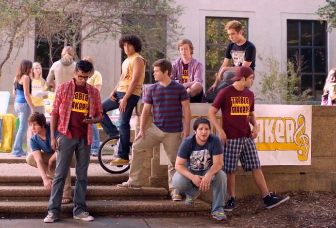
Who knew a movie about a cappella would become such a success that it would claim the honor of second highest grossing musical comedy film of all time? I love this movie, and was so honored to see Weltron 2001 being used for the logo of the Barden Treblemakers. The sequel to Pitch Perfect is set to […]
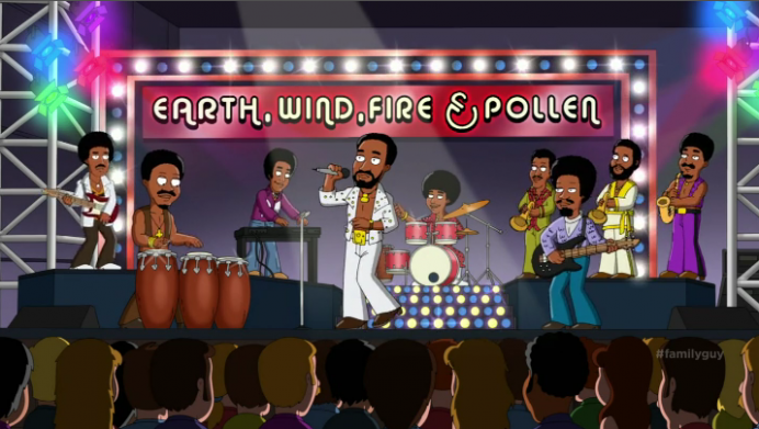
Alba font used in Family Guy, Season 12, Episode 7 “Into Harmony’s Way”, as the logotype for the band Earth, Wind, Fire and Pollen, a band Mort Guffman managed in the 70s.
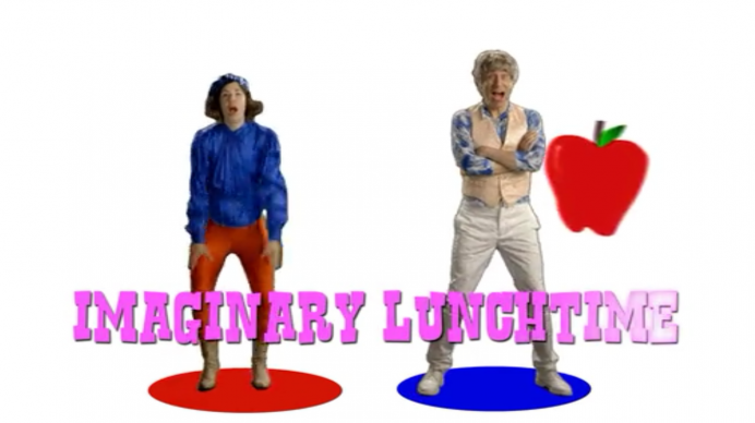
Netflix just dropped Season 4 of Portlandia this week! This font sighting is a throwback to Season 3 where Brendan and Michelle start a band that makes kids music and they used Rustler in the music video.
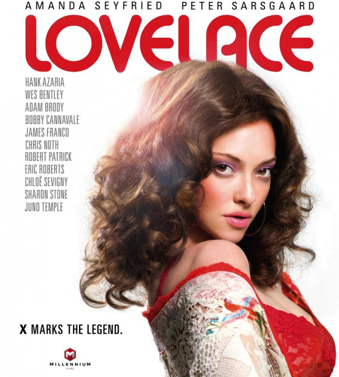
Alba is back at it again, this time gracing the movie credits and advertising for Lovelace, the 2013 biographical film about porn star Linda Lovelace, starring Amanda Seyfried. Ooh la la!
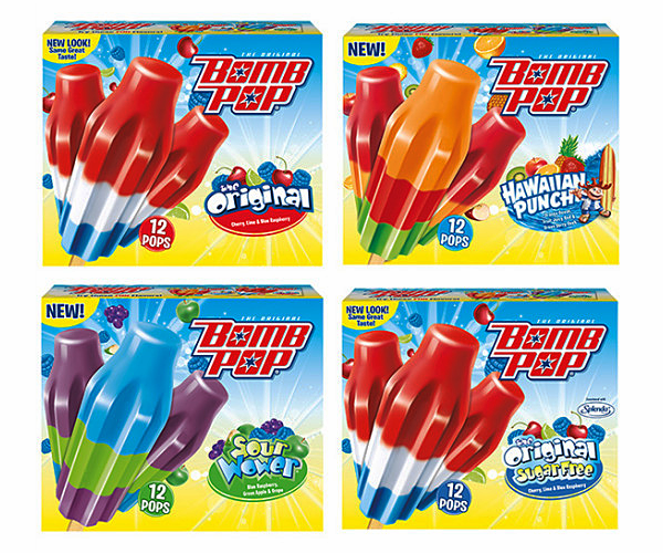
The next time you pass through the frozen foods aisle, you might notice Baby Kruffy front and center of the product packaging for Bomb Pops!
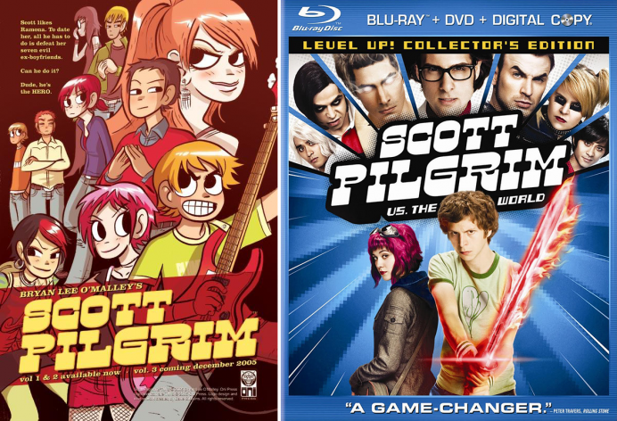
Speaking of Arrested Development, Michael Cera’s movies in the past have been big lovers of Fontalicious fonts. This sighting is of the font Superfly, on the movie poster of the comedy film Scott Pilgrim vs. the World. It was also used as the title typeface for the original graphic novels by Bryan Lee O’Malley.
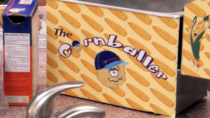
I totally forgot Smartie was used for the logo of the infamous Cornballer on the television show, Arrested Development. The Cornballer, was invented by George Bluth in the mid-1970s, and was a pretty unsafe device used to make what else, cornballs!

